问题
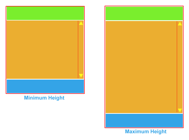
How would I go about designing a website which has a fixed height header and footer (attached to the top and bottom of the browser window) but an expanding middle. The scroll bars would be only for the middle (orange section in diagram) so that the rest of the page would never need to scroll. I have drawn a mock-up below to explain more clearly.
Ideally it needs to be entirely implemented in CSS and HTML (no javascript fiddles!). I've got quite far with this problem but I can't force the orange section to fill up the remaining space when it isn't full(whatever it's content) and start scrolling if it overflows.

回答1:
I think this is what you want:
Live Demo (edit)
HTML:
<div id="header">Patrick</div>
<div id="content">..</div>
<div id="footer">Beardmore</div>
CSS:
html, body {
    margin: 0;
    padding: 0;
    border: 0;
    overflow: hidden
}
#header, #content, #footer {
    position: absolute;
    left: 0;
    width: 100%
}
#header {
    top: 0;
    height: 100px;

    background: #ccc
}
#content {
    top: 100px;
    bottom: 100px;
    overflow-y: auto
}
#footer {
    bottom: 0;
    height: 100px;

    background: #ccc
}
回答2:
It's called StickyFooter or the "footer push" method. It's all over the web, but this is the best option I've found:
http://ryanfait.com/sticky-footer/
回答3:
An old question, but flexbox has given us a super easy way to implement this pattern, a familiar variation on the 'Holy Grail' layout:
body {
  /*set container to vertical (column) flex mode, ensure body is full height*/
  display: flex;
  min-height: 100vh;
  flex-direction: column;
}
header, footer {
  /*more or less equivalent to min-height:50px*/
  flex-basis:50px
}
header {
  background-color: #7AEE2D;
}
main {
  background-color: #EBAE30;
  /*tell main section to expand to fill available space, this is same as flex 1; or flex:1 1 auto;*/
  flex-grow:1;
}
footer {
  background-color: #34A4E7;
}
<header>header</header>
<main>main</main>
<footer>footer</footer>A note about the syntax: I've used the "atomic" flexbox CSS properties here for simplicity, but in the wild you are more likely to run into the shorthand syntax using the flex keyword by itself. The default values for the 3 properties you can set on flex items (children of a display:flex container) are:
Initial value as each of the properties of the shorthand: flex-grow: 0 flex-shrink: 1 flex-basis: auto
Using flex, there are multiple ways to compose these properties, specifying one, two, or three values, and those values can by keywords, unit lengths (2px), or unitless grow/shrink ratios 2. Many different "overloads" are available, depending on your arguments.
For example, flex-basis:50px could've been flex:50px, flex:0 1 50px, and flex-grow:1 could have been flex 1; or flex:1 1 auto;. It's still not as bad as some other CSS shorthands I can think of (position, I'm looking at you). The 'flex' shorthand syntax MDN page has more details.
来源:https://stackoverflow.com/questions/5069166/an-expanding-middle-in-css