介绍
这是plotly最近发表的《使用Pandas和SQLite 进行 大数据分析》的R版本 。我认为这是“中等”数据,但是,我知道有必要生成一个不错的标题。对于R族,我还将扩展可改善工作流程的替代软件包和方法。
本文并不表示R在数据分析方面比Python更好或更快速,我本人每天都使用两种语言。这篇可口的文章只是提供了比较这两种语言的机会。
本文中的 数据 每天都会更新,因此我的文件版本更大,为4.63 GB。因此,预计图表将返回与文章相比不同的结果。
以下是本文引用的详细信息……
自2003年以来,该笔记本浏览了一个3.9GB的CSV文件,其中包含纽约市的311条投诉。它是纽约市开放数据门户网站中最受欢迎的数据集。
该笔记本是有关内存不足数据分析的入门
- pandas :一个具有易于使用的数据结构和数据分析工具的库。此外,还可以连接到内存不足数据库(如SQLite)。
- IPython notebook :用于编写和共享python代码,文本和绘图的接口。
- SQLite :一个独立的,无服务器的数据库,易于从Pandas进行设置和查询。
- plotly :一个用于将漂亮的交互式图形从Python发布到Web的平台。
数据集太大,无法加载到Pandas数据框中。因此,相反,我们将使用SQLite执行内存不足聚合,然后使用Panda的iotools将结果直接加载到数据帧中。将CSV流式传输到SQLite非常容易,并且SQLite无需设置。SQL查询语言来自Pandas的思维方式,非常直观。
由于我们使用的是R,因此我们将用最接近的R对应项替换python软件包,这当然是主观的。
-
代替 IPython笔记本, 我 通过 RStudio使用knitr / Rmarkdown发布了此文档
-
我将继续使用SQLite,并 使用R & ggplot2进行绘制。但是,对于时间序列图,我强烈建议您使用R封装 dygraph,它可以提供类似的交互式绘图,而无需Internet连接。
在可能的情况下,我将概述替代其他R程序包的机会,我认为这可能会改善工作流程。
数据工作流程
在R中进行情节设置
R的Plotly 在CRAN上尚不可用 。我们可以改为从rOpenSci github 存储库下载它 。
install.packages("devtools")
library("devtools")
install_github("ropensci/plotly")
library(plotly)
您需要创建一个帐户以连接到plotly API。或者,您可以只使用默认的ggplot2图形。
set_credentials_file("DemoAccount", "lr1c37zw81") ## Replace contents with your API Key
在SQLite中导入CSV
这违背了本文的目的,但是 R可以轻松地 将此数据加载到内存中 。如果您的计算机资源允许,那么与磁盘上的SQL数据库相比,数据在内存中进行操作的速度将更快。在这种情况下,需要8GB的RAM。本着真正比较的精神,我将使用SQLite数据库复制磁盘上的分析方法,但是,我将展示一些使用内存中数据的基准测试 data.table 方法。
使用dplyr在R中进行磁盘上分析
尽管 dplyr 能够写入数据库,但是数据仍然必须流经R,在这种情况下,它可能被认为是作弊行为。另一种方法是简单地创建数据库并使用命令行导入csv。 如果您有任何其他建议,请为此github存储库创建请求请求 。
这是我在命令行中键入的代码。很容易吧?假设您已安装sqlite3并在PATH变量上可用(因此可通过终端访问)。
$ sqlite3 data.db # Create your database
$.databases       # Show databases to make sure it works
$.mode csv
$.import <filename> <tablename>
# Where filename is the name of the csv & tablename is the name of the new database table
$.quit
让我们也将数据加载到内存中,以便我们可以一路比较内存操作。这是R.readr中文件I / O的粗略基准。 最近发布的替代方法也 read.csv 应该快速读取这些数据。
library(readr)
# data.table, selecting a subset of columns
time_data.table <- system.time(fread('/users/ryankelly/NYC_data.csv',
                   select = c('Agency', 'Created Date','Closed Date', 'Complaint Type', 'Descriptor', 'City'),
                   showProgress = T))
# Default data.table
time_data.table_full <- system.time(fread('/users/ryankelly/NYC_data.csv',
                                            showProgress = T))
# Default readr
time_readr <- system.time(read_csv('/users/ryankelly/NYC_data.csv'))

# Default base R (really slow - don't recommend running)
# time_base_r <- system.time(read.csv('/users/ryankelly/NYC_data.csv'))
kable(data.frame(rbind(time_data.table, time_data.table_full, time_readr)))
| user.self | sys.self | elapsed | user.child | sys.child | |
|---|---|---|---|---|---|
| time_data.table | 63.588 | 1.952 | 65.633 | 0 | 0 |
| time_data.table_full | 205.571 | 3.124 | 208.880 | 0 | 0 |
| time_readr | 277.720 | 5.018 | 283.029 | 0 | 0 |
我将使用data.table读取数据。该 fread 函数具有非常好的选择我们想要读取的列的能力,这大大提高了读取速度。这篇散文文章忽略了数据集中除以下各列以外的所有列。
library(data.table)

dt <- fread('/users/ryankelly/NYC_data.csv',
            select = c('Agency', 'Created Date','Closed Date', 'Complaint Type', 'Descriptor', 'City'),
            showProgress = F)

# Rename columns to remove spaces
setnames(dt, 'Created Date', 'CreatedDate')
setnames(dt, 'Closed Date', 'ClosedDate')
setnames(dt, 'Complaint Type', 'ComplaintType')
关于dplyr
在语言之间切换在认知上具有挑战性(特别是因为R和SQL如此危险地相似),因此dplyr允许您编写自动翻译为SQL的R代码。dplyr的目标不是用R函数替换每个SQL函数:这将很困难且容易出错。相反,dplyr仅生成SELECT语句,这是您作为分析人员最常编写的SQL。- dplyr数据库
dplyr非常棒,因为您可以使用 相同的 语法来:
- 将数据框写入数据库
- 从数据库读入内存
- 通过SQL包装器在数据库上操作
- 在内存上操作
如果您需要运行更复杂的查询,或者如果您希望使用普通SQL,则还可以简单地将SQL语句作为字符串传递,或生成自己的sql包装器。dplyr支持:sqlite,mysql,postgresql和google的bigquery。您将看到dplyr的语法与SQL非常相似。
有关dplyr的更多信息,请参阅以下两个教程,我从中大量借鉴了这些知识:
默认情况下,dplyr查询只会从数据库中提取前10行,并且除非您直接要求,否则绝不会将数据提取到R中。
library(dplyr)      ## Will be used for pandas replacement

# Connect to the database
db <- src_sqlite('/users/ryankelly/data.db')
db
## src:  sqlite 3.8.6 [/users/ryankelly/data.db]
## tbls: NYC_data
# Connect to the table of interest, which I called NYC_data
data <- tbl(db, 'NYC_data')
# We can pass SQL directly here to select only the columns of interest
# I 'rename' the columns with spaces to be able to properly access them in dplyr
data <- tbl(db, sql('SELECT Agency, "Created Date" AS CreatedDate,
                    "Closed Date" AS ClosedDate, "Complaint Type" AS ComplaintType,  Descriptor, City
                    FROM NYC_data'))
一旦我们不得不执行更昂贵的查询,数据就变得非常缓慢。 这在Python或R中都是显而易见的。这就是为什么您宁愿对内存中的数据进行操作的原因。数据处理的两个最佳选择(除了R之外)是:
- 数据表
- dplyr
请记住,以下分析是使用dplyr作为SQL语句的包装程序在磁盘上完成的。使用 explain() 暴露在你的语句在SQL命令。如果愿意,可以只使用原始SQL字符串。 我还将data.table 在注释中显示如何运行相同的命令 。
我不会对每个查询进行基准测试,因为有许多 示例说明 了data.table的速度优势。我更喜欢data.table来提高速度和紧凑语法。在data.table先看看,看看这个 cheatsheet文件。
预览数据
我将 kable() 整个文档用作打印漂亮表格的一种方式。
# Wrapped in a function for display purposes
head_ <- function(x, n = 5) kable(head(x, n))

head_(data)
| Agency | CreatedDate | ClosedDate | ComplaintType | Descriptor | City |
|---|---|---|---|---|---|
| NYPD | 04/11/2015 02:13:04 AM | Noise - Street/Sidewalk | Loud Music/Party | BROOKLYN | |
| DFTA | 04/11/2015 02:12:05 AM | Senior Center Complaint | N/A | ELMHURST | |
| NYPD | 04/11/2015 02:11:46 AM | Noise - Commercial | Loud Music/Party | JAMAICA | |
| NYPD | 04/11/2015 02:11:02 AM | Noise - Street/Sidewalk | Loud Talking | BROOKLYN | |
| NYPD | 04/11/2015 02:10:45 AM | Noise - Street/Sidewalk | Loud Music/Party | NEW YORK |
仅选择几列
# dt[, .(ComplaintType, Descriptor, Agency)]

q <- data %>% select(ComplaintType, Descriptor, Agency)
head_(q)
| ComplaintType | Descriptor | Agency |
|---|---|---|
| Noise - Street/Sidewalk | Loud Music/Party | NYPD |
| Senior Center Complaint | N/A | DFTA |
| Noise - Commercial | Loud Music/Party | NYPD |
| Noise - Street/Sidewalk | Loud Talking | NYPD |
| Noise - Street/Sidewalk | Loud Music/Party | NYPD |
限制检索到的项目数
# dt[, .(ComplaintType, Descriptor, Agency)][1:10]

q <- data %>% select(ComplaintType, Descriptor, Agency)
head_(q, n = 10)
| ComplaintType | Descriptor | Agency |
|---|---|---|
| Noise - Street/Sidewalk | Loud Music/Party | NYPD |
| Senior Center Complaint | N/A | DFTA |
| Noise - Commercial | Loud Music/Party | NYPD |
| Noise - Street/Sidewalk | Loud Talking | NYPD |
| Noise - Street/Sidewalk | Loud Music/Party | NYPD |
| Noise - Street/Sidewalk | Loud Talking | NYPD |
| Noise - Commercial | Loud Music/Party | NYPD |
| HPD Literature Request | The ABCs of Housing - Spanish | HPD |
| Noise - Street/Sidewalk | Loud Talking | NYPD |
| Street Condition | Plate Condition - Noisy | DOT |
使用WHERE过滤行
# dt[Agency == 'NYPD', .(ComplaintType, Descriptor, Agency)]

q <- data %>%
          select(ComplaintType, Descriptor, Agency) %>%
          filter(Agency == "NYPD")
head_(q)
| ComplaintType | Descriptor | Agency |
|---|---|---|
| Noise - Street/Sidewalk | Loud Music/Party | NYPD |
| Noise - Commercial | Loud Music/Party | NYPD |
| Noise - Street/Sidewalk | Loud Talking | NYPD |
| Noise - Street/Sidewalk | Loud Music/Party | NYPD |
| Noise - Street/Sidewalk | Loud Talking | NYPD |
使用WHERE和IN过滤列中的多个值
# dt[Agency == 'NYPD' | Agency == 'DOB', .(ComplaintType, Descriptor, Agency)]

q <- data %>% select(ComplaintType, Descriptor, Agency) %>%
               filter(Agency %in% c('DOB', 'NYPD'))
head_(q)
| ComplaintType | Descriptor | Agency |
|---|---|---|
| Noise - Street/Sidewalk | Loud Music/Party | NYPD |
| Noise - Commercial | Loud Music/Party | NYPD |
| Noise - Street/Sidewalk | Loud Talking | NYPD |
| Noise - Street/Sidewalk | Loud Music/Party | NYPD |
| Noise - Street/Sidewalk | Loud Talking | NYPD |
在DISTINCT列中查找唯一值
# dt[, unique(City)]

q <- data %>% select(City) %>% distinct()
head(q)
##       City
## 1 BROOKLYN
## 2 ELMHURST
## 3  JAMAICA
## 4 NEW YORK
## 5
## 6  BAYSIDE
使用COUNT(*)和GROUP BY查询值计数
# dt[, .(No.Complaints = .N), Agency]
#setkey(dt, No.Complaints) # setkey index's the data

q <- data %>% select(Agency) %>% group_by(Agency) %>% summarise(No.Complaints = n())
head_(q)
| Agency | No.Complaints |
|---|---|
| 3-1-1 | 22499 |
| ACS | 3 |
| AJC | 7 |
| ART | 3 |
| CAU | 8 |
使用ORDER和-排序结果
# dt[, .(No.Complaints = .N), Agency]
#setkey(dt, No.Complaints) # setkey index's the data

q <- data %>% select(Agency) %>%
              group_by(Agency) %>%
              summarise(No.Complaints = n()) %>%
              arrange(-No.Complaints)

# Pull the data out of memory to plot it
q <- collect(q)

# Convert to ordered factor to maintain order in plot
q$Agency <- factor(q$Agency, levels = q$Agency, ordered = T)

library(ggplot2)
# Plot top 50
plt <- ggplot(q[1:50,], aes(Agency, No.Complaints)) +
        geom_bar(stat= 'identity') +
        theme_minimal() + theme(axis.text.x = element_text(angle = 45, hjust = 1))

# Convert to plotly object
py <- plotly()
py$ggplotly(plt, session='knitr')
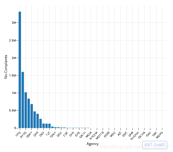
![]()
# dt[, .(No.Complaints = .N), ComplaintType]
#setkey(dt, No.Complaints) # setkey index's the data

q <- data %>% select(ComplaintType, Agency) %>%
              group_by(ComplaintType) %>%
              summarise(No.Complaints = n()) %>%
              arrange(-No.Complaints)

# Pull the data out of memory to plot it
q <- collect(q)

# Convert to ordered factor to maintain order in plot
q$ComplaintType <- factor(q$ComplaintType, levels = q$ComplaintType, ordered = T)

# Plot the data (top 50)
plt <- ggplot(q[1:50,], aes(x = ComplaintType, y = No.Complaints)) +
            geom_bar(stat= 'identity') +
            theme_minimal() + theme(axis.text.x = element_text(angle = 45, hjust = 1))

# Convert to plotly object
py <- plotly()
py$ggplotly(plt, session='knitr')
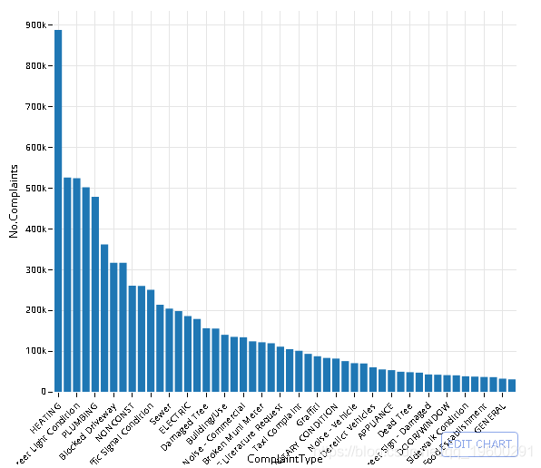
![]()
数据库中有多少个城市?
# dt[, unique(City)]

q <- data %>% select(City) %>% distinct() %>% summarise(Number.of.Cities = n())
head(q)
##   Number.of.Cities
## 1             1818
Yikes-让我们来绘制10个最受关注的城市
# dt[, (No.Complaints = .N), City]
#setkey(dt, No.Complaints)

q <- data %>% select(City) %>% group_by(City) %>%
        summarise(No.Complaints = n()) %>%
        arrange(-No.Complaints)

head_(q, 10)
| City | No.Complaints |
|---|---|
| BROOKLYN | 2671085 |
| NEW YORK | 1692514 |
| BRONX | 1624292 |
| 766378 | |
| STATEN ISLAND | 437395 |
| JAMAICA | 147133 |
| FLUSHING | 117669 |
| ASTORIA | 90570 |
| Jamaica | 67083 |
| RIDGEWOOD | 66411 |
- 法拉盛和冲洗,牙买加和牙买加……这些投诉是区分大小写的。
-
使用COLLATE NOCASE的GROUP BY执行不区分大小写的查询
- 我决定使用
UPPER转换CITY格式。
# dt[, CITY := toupper(City)][, (No.Complaints = .N), CITY]
#setkey(dt, No.Complaints)

# No clear way to do this using dplyr functions - default to regular SQL
q <- tbl(db, sql('SELECT UPPER(City) as "CITY", COUNT(*) as "No.Complaints"
                    FROM NYC_data
                    GROUP BY "CITY"
                    ORDER BY -"No.Complaints"
                    LIMIT 11'))

head_(q, 10)
| CITY | No.Complaints |
|---|---|
| BROOKLYN | 2671085 |
| NEW YORK | 1692514 |
| BRONX | 1624292 |
| 766378 | |
| STATEN ISLAND | 437395 |
| JAMAICA | 147133 |
| FLUSHING | 117669 |
| ASTORIA | 90570 |
| JAMAICA | 67083 |
| RIDGEWOOD | 66411 |
投诉类型(按城市)
- 这本可重复的文章遍历每个城市并运行sql命令。只需按两列
City和Complaint类型分组即可 完成同一任务。为了显示目的,我减少了此处绘制的项目数量。
# dt[, CITY := toupper(City)][, (No.Complaints = .N), .(ComplaintType, CITY)]
#setkey(dt, No.Complaints)

# No clear way to do this using dplyr functions - default to regular SQL
q <- tbl(db, sql('SELECT "Complaint Type" as "ComplaintType", UPPER(City) as "CITY",
                    COUNT(*) as "No.Complaints"
                    FROM NYC_data
                    GROUP BY CITY, ComplaintType
                    ORDER BY -"No.Complaints"'))


# Select only list of cities used in ploty article
q_f <- filter(q, CITY %in% c(
                        'FAR ROCKAWAY',
                        'FLUSHING',
                        'JAMAICA',
                        'STATEN ISLAND',
                        'BRONX',
                        'NEW YORK',
                        'BROOKLYN'
))

# Pull the data out of memory to plot it
q_f <- collect(q_f)

# Select a cutoff for the most popular complaints to plot
# dt[, sum(No.Complaints), ComplaintType][, .(ComplaintType)]
top_complaints <- q_f%>% group_by(ComplaintType) %>%
                        summarise(n = sum(No.Complaints)) %>%
                        arrange(-n)
# Top 15 complaints
q_f <- filter(q_f, ComplaintType %in% top_complaints$ComplaintType[1:15])

# Plot result
plt <- ggplot(q_f, aes(ComplaintType, No.Complaints, fill = CITY)) +
            geom_bar(stat = 'identity') +
            theme_minimal() + theme(axis.text.x = element_text(angle = 45, hjust = 1))

plt
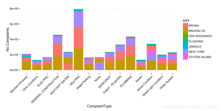
![]()
# plotly cannot handle this type of plot currently.
现在让我们归一化这些计数。由于此数据已被简化为一个数据帧,因此这非常容易。
# dt[, No.Complaints_normalized := No.Complaints / sum(No.Complaints)]
q_f <- q_f %>% group_by(CITY) %>%
                mutate(Normalized.Complaints = round((No.Complaints / sum(No.Complaints))*100, 2))

# Plot result
plt <- ggplot(q_f, aes(ComplaintType, Normalized.Complaints, fill = CITY)) +
    geom_bar(stat = 'identity', position = 'dodge') +
    theme_minimal() + theme(axis.text.x = element_text(angle = 45, hjust = 1)) +
    ggtitle('Relative Number of Complaints by City')

plt
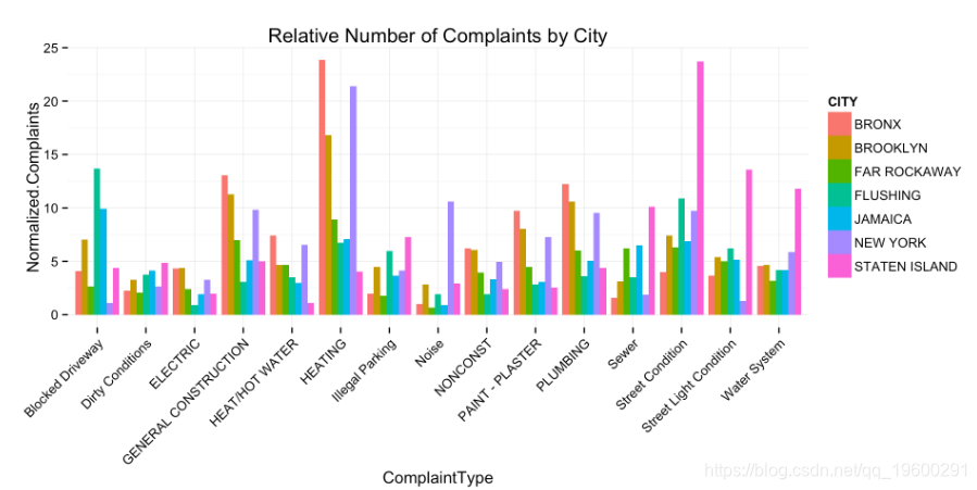
![]()
# plotly cannot handle this type of plot currently.
- 纽约很大声。
- 史泰登岛很脏,很黑,很潮湿
- 布朗克斯有大量的垃圾收集。
- 法拉盛的市政流量计坏了。
为了说明使用R,我将使用dplyr。这不一定是最佳方法。在这里,我选择日期字段的子字符串,并将其 SUBSTR 与串联 ||。
第2部分时间序列运算
提供的数据不适合SQLite的标准日期格式。我们有几种解决方法:
在SQL数据库中创建一个新列,然后使用格式化的date语句重新插入数据 创建一个新表并将格式化日期插入原始列名 使用dplyr生成格式化日期的SELECT包装器。
data <- tbl(db, sql('SELECT Agency, "Complaint Type" AS ComplaintType, Descriptor, City,
                    SUBSTR("Created Date", 7, 4) || "-" ||
                    SUBSTR("Created Date", 4, 2) || "-" ||
                    SUBSTR("Created Date", 1, 2) || " " ||
                    SUBSTR("Created Date", 12, 2) || ":" ||
                    SUBSTR("Created Date", 15, 2) || ":" ||
                    SUBSTR("Created Date", 18, 2) as CreatedDate,

                    SUBSTR("Closed Date", 7, 4) || "-" ||
                    SUBSTR("Closed Date", 4, 2) || "-" ||
                    SUBSTR("Closed Date", 1, 2) || " " ||
                    SUBSTR("Closed Date", 12, 2) || ":" ||
                    SUBSTR("Closed Date", 15, 2) || ":" ||
                    SUBSTR("Closed Date", 18, 2) as ClosedDate

            FROM NYC_data'))
使用时间戳字符串过滤SQLite行:YYYY-MM-DD hh:mm:ss
# dt[CreatedDate < '2014-11-26 23:47:00' & CreatedDate > '2014-09-16 23:45:00',
#      .(ComplaintType, CreatedDate, City)]

q <- data %>% filter(CreatedDate < "2014-11-26 23:47:00",   CreatedDate > "2014-09-16 23:45:00") %>%
    select(ComplaintType, CreatedDate, City)

head_(q)
| ComplaintType | CreatedDate | City |
|---|---|---|
| Noise - Street/Sidewalk | 2014-11-12 11:59:56 | BRONX |
| Taxi Complaint | 2014-11-12 11:59:40 | BROOKLYN |
| Noise - Commercial | 2014-11-12 11:58:53 | BROOKLYN |
| Noise - Commercial | 2014-11-12 11:58:26 | NEW YORK |
| Noise - Street/Sidewalk | 2014-11-12 11:58:14 | NEW YORK |
使用strftime从时间戳中拉出小时单位
- 有关所有
format方法,请参见?strftime
# dt[, hour := strftime('%H', CreatedDate), .(ComplaintType, CreatedDate, City)]

q <- data %>% mutate(hour = strftime('%H', CreatedDate)) %>%
            select(ComplaintType, CreatedDate, City, hour)

head_(q)
| ComplaintType | CreatedDate | City | hour |
|---|---|---|---|
| Noise - Street/Sidewalk | 2015-11-04 02:13:04 | BROOKLYN | 02 |
| Senior Center Complaint | 2015-11-04 02:12:05 | ELMHURST | 02 |
| Noise - Commercial | 2015-11-04 02:11:46 | JAMAICA | 02 |
| Noise - Street/Sidewalk | 2015-11-04 02:11:02 | BROOKLYN | 02 |
| Noise - Street/Sidewalk | 2015-11-04 02:10:45 | NEW YORK | 02 |
用strftime,GROUP BY和count(*)(n())计算每小时的投诉(行)数
# dt[, hour := strftime('%H', CreatedDate), .N , hour]

q <- data %>% mutate(hour = strftime('%H', CreatedDate)) %>%
    group_by(hour) %>% summarise(Complaints.per.Hour = n())

# Collect the data into memory
q <- collect(q)

plt <- ggplot(na.omit(q), aes(hour, Complaints.per.Hour)) +
        geom_bar(stat='identity') + theme_minimal()

# Convert to plotly object
py <- plotly()
py$ggplotly(plt, session='knitr')
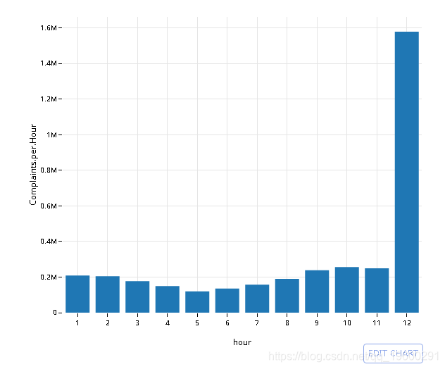
![]()
# dt[grepl(ComplaintType, 'Noise'), hour := strftime('%H', CreatedDate), .N , hour]

q <- data %>% filter(ComplaintType %in% c( "Noise",
                                           "Noise - Street/Sidewalk",
                                           "Noise - Commercial",
                                           "Noise - Vehicle",
                                           "Noise - Park",
                                           "Noise - House of Worship",
                                           "Noise - Helicopter",
                                           "Collection Truck Noise"))  %>%
    mutate(hour = strftime('%H', CreatedDate)) %>%
    group_by(hour) %>% summarise(Complaints.per.Hour = n())

# Collect the data into memory
q <- collect(q)
# omit NA
plt <- ggplot(na.omit(q), aes(hour, Complaints.per.Hour)) +
            geom_bar(stat='identity') + theme_minimal()

# Convert to plotly object
py <- plotly()
py$ggplotly(plt, session='knitr')
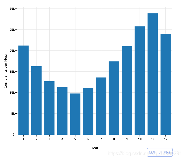
![]()
- 与使用 语句中的两个字段的情节文章相比,这可以写得更简洁
GROUP_BY()。
# dt[grepl(ComplaintType, 'Noise'), hour := strftime('%H', CreatedDate), .N , hour]
# setkey(dt, Complaints.per.Hour)
# dt[, tail(.SD, 2), hour]

q <- data %>%
    mutate(hour = strftime('%H', CreatedDate)) %>%
    group_by(hour, ComplaintType) %>% summarise(Complaints.per.Hour = n())

# Collect the data into memory
q <- collect(q)
# omit NA
q <- na.omit(q)

# Grab the 2 most common complaints for that hour
# Top 6 is way too many colors
q_hr <-q %>%
      group_by(hour) %>%
      top_n(n = 2, wt = Complaints.per.Hour)

# Plot (something appears to be off with midnight in my dataset)
plt <- ggplot(q_hr[q_hr$hour != '12',], aes(hour, Complaints.per.Hour, fill = ComplaintType)) +
            geom_bar(stat='identity') + theme_minimal()

# Convert to plotly object
py <- plotly()
py$ggplotly(plt, session='knitr')
汇总时间序列
首先,创建一个时间戳记四舍五入到前15分钟间隔的新列
# Using lubridate::new_period()
# dt[, interval := CreatedDate - new_period(900, 'seconds')][, .(CreatedDate, interval)]

q <- data %>%
     mutate(interval = sql("datetime((strftime('%s', CreatedDate) / 900) * 900, 'unixepoch')")) %>%
     select(CreatedDate, interval)

head_(q, 10)
| CreatedDate | interval |
|---|---|
| 2015-11-04 02:13:04 | 2015-11-04 02:00:00 |
| 2015-11-04 02:12:05 | 2015-11-04 02:00:00 |
| 2015-11-04 02:11:46 | 2015-11-04 02:00:00 |
| 2015-11-04 02:11:02 | 2015-11-04 02:00:00 |
| 2015-11-04 02:10:45 | 2015-11-04 02:00:00 |
| 2015-11-04 02:09:07 | 2015-11-04 02:00:00 |
| 2015-11-04 02:05:47 | 2015-11-04 02:00:00 |
| 2015-11-04 02:03:43 | 2015-11-04 02:00:00 |
| 2015-11-04 02:03:29 | 2015-11-04 02:00:00 |
| 2015-11-04 02:02:17 | 2015-11-04 02:00:00 |
然后,GROUP BY该间隔和COUNT(*)
# Using lubridate::new_period()
# dt[, interval := CreatedDate - new_period(900, 'seconds')][, .N, interval]

q <- data %>%
     mutate(interval = sql("datetime((strftime('%s', CreatedDate) / 900) * 900, 'unixepoch')")) %>%
     group_by(interval) %>%
     summarise(Complaints.per.Interval = n()) %>% filter(!is.na(Complaints.per.Interval))

head_(q, 10)
| interval | Complaints.per.Interval |
|---|---|
| NA | 5447756 |
| 2003-01-03 01:00:00 | 1 |
| 2003-01-03 03:15:00 | 2 |
| 2003-01-03 06:30:00 | 2 |
| 2003-01-03 06:45:00 | 1 |
| 2003-01-03 07:30:00 | 1 |
| 2003-01-03 09:15:00 | 1 |
| 2003-01-03 09:30:00 | 1 |
| 2003-01-03 09:45:00 | 1 |
| 2003-01-03 11:00:00 | 1 |
# Pull data into memory
q <- collect(q %>% filter(strftime('%Y', interval) == '2003'))
绘制2003年的结果
# Convert to proper datetime object
q$interval <- strptime(q$interval, '%Y-%m-%d %H:%M')

plt <- ggplot(q, aes(x=interval, y=Complaints.per.Interval)) +
            geom_bar(stat='identity') +
            theme_minimal()

# Convert to plotly object
py <- plotly()
py$ggplotly(plt, session='knitr')
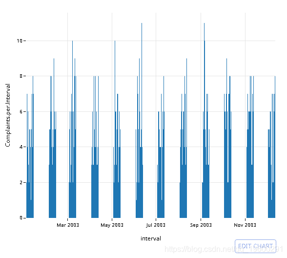
![]()
# Using lubridate::new_period()
# dt[, interval := CreatedDate - new_period(86400, 'seconds')][, .N, interval]

q <- data %>%
     mutate(interval = sql("datetime((strftime('%s', CreatedDate) / 86400) * 86400, 'unixepoch')")) %>%
     group_by(interval) %>%
     summarise(Complaints.per.Interval = n()) %>% filter(!is.na(Complaints.per.Interval))

# Collect into memory
q <- collect(q)
# Convert to proper datetime object
q$interval <- strptime(q$interval, '%Y-%m-%d %H:%M')

plt <- ggplot(q, aes(x=interval, y=Complaints.per.Interval)) +
        geom_bar(stat='identity') +
        theme_minimal()

# Convert to plotly object
py <- plotly()
py$ggplotly(plt, session='knitr')
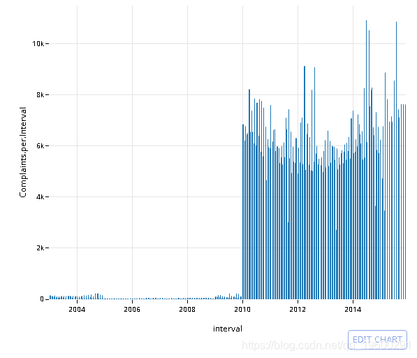
![]()
来源:https://www.cnblogs.com/tecdat/p/12092166.html