I am looking to add scroll support to more than just a single, scrollable, child view of CoordinatorLayout in conjunction with an AppBarLayout and CollapsingToolbarLayout. When scrolling the RecyclerView or the AppBarLayout (condensed code below), the app bar and its contents successfully scroll and collapse. However, when attempting to initiate a scroll event on the LinearLayout above the RecyclerView, nothing happens because the LinearLayout does not know to scroll or collapse the view.
The goal is to have the LinearLayout act as a sticky header to the RecyclerView and footer to the AppBarLayout and receive the same scrolling behavior as the RecyclerView, similar to Spotify's shuffle play/available offline header. In fact, it would be great if the appbar_scrolling_view_behavior layout_behavior could be applied to the LinearLayout similarly to the RecyclerView, but I imagine that the behavior is ignored on non-scrollable views. Is anyone aware of a workaround for this that does not require implementing the LinearLayout view as a row in the RecyclerView?
<android.support.design.widget.CoordinatorLayout
    xmlns:android="http://schemas.android.com/apk/res/android"
    xmlns:app="http://schemas.android.com/apk/res-auto"
    xmlns:tools="http://schemas.android.com/tools"
    android:layout_width="match_parent"
    android:layout_height="match_parent">

    <android.support.design.widget.AppBarLayout
        android:id="@+id/app_bar_layout"
        android:layout_width="match_parent"
        android:layout_height="@dimen/collapsible_app_bar_height"
        android:theme="@style/ThemeOverlay.AppCompat.Dark.ActionBar">

        <android.support.design.widget.CollapsingToolbarLayout
            android:id="@+id/collapsing_toolbar_layout"
            android:layout_width="match_parent"
            android:layout_height="match_parent"
            android:background="@drawable/gradient_banner"
            app:contentScrim="@color/background_content_frame"
            app:layout_scrollFlags="scroll|exitUntilCollapsed">

            <ImageView
                android:id="@+id/image_header"
                android:layout_width="match_parent"
                android:layout_height="match_parent"
                android:src="@drawable/some_image"
                app:layout_collapseMode="parallax"/>

            <android.support.v7.widget.Toolbar
                android:id="@+id/collapsible_toolbar"
                android:layout_width="match_parent"
                android:layout_height="?attr/actionBarSize"
                android:theme="@style/ThemeOverlay.AppCompat.Dark.ActionBar"
                app:layout_collapseMode="pin"/>

        </android.support.design.widget.CollapsingToolbarLayout>

    </android.support.design.widget.AppBarLayout>

    <LinearLayout
        android:layout_width="match_parent"
        android:layout_height="@dimen/slide_handle_height"
        android:orientation="horizontal"
        android:background="@color/slide_handle"
        android:gravity="center_vertical">

        <!-- three buttons -->

    </LinearLayout>

    <android.support.v7.widget.RecyclerView
        android:id="@+id/recycler_view"
        android:layout_width="match_parent"
        android:layout_height="match_parent"
        android:layout_marginTop="@dimen/slide_handle_height"
        android:scrollbars="vertical"
        app:layout_behavior="@string/appbar_scrolling_view_behavior"/>

</android.support.design.widget.CoordinatorLayout>
You don't need a workaround or something strange. This behaviour is supported by the library. Just replace your LinearLayout by this and put it below the RecyclerView:
<android.support.v4.widget.NestedScrollView
    android:layout_width="match_parent"
    android:layout_height="wrap_content"
    app:layout_behavior="@string/appbar_scrolling_view_behavior">

    <LinearLayout
        android:layout_width="match_parent"
        android:layout_height="wrap_content"
        android:orientation="vertical"
        android:gravity="center">

        <Button
            android:layout_width="wrap_content"
            android:layout_height="wrap_content"
            android:padding="15dp"
            android:text="Button text"/>

    </LinearLayout>

</android.support.v4.widget.NestedScrollView>
Also you will need to put this in your RecyclerView to show it behind the LinearLayout:
    android:paddingTop="30dp"
    android:clipToPadding="false"
This is how it would look like:
<android.support.design.widget.CoordinatorLayout
    xmlns:android="http://schemas.android.com/apk/res/android"
    xmlns:app="http://schemas.android.com/apk/res-auto"
    xmlns:tools="http://schemas.android.com/tools"
    android:layout_width="match_parent"
    android:layout_height="match_parent">

<android.support.design.widget.AppBarLayout
    android:id="@+id/app_bar_layout"
    android:layout_width="match_parent"
    android:layout_height="@dimen/collapsible_app_bar_height"
    android:theme="@style/ThemeOverlay.AppCompat.Dark.ActionBar">

    <android.support.design.widget.CollapsingToolbarLayout
        android:id="@+id/collapsing_toolbar_layout"
        android:layout_width="match_parent"
        android:layout_height="match_parent"
        android:background="@drawable/gradient_banner"
        app:contentScrim="@color/background_content_frame"
        app:layout_scrollFlags="scroll|exitUntilCollapsed">

        <ImageView
            android:id="@+id/image_header"
            android:layout_width="match_parent"
            android:layout_height="match_parent"
            android:src="@drawable/some_image"
            app:layout_collapseMode="parallax"/>

        <android.support.v7.widget.Toolbar
            android:id="@+id/collapsible_toolbar"
            android:layout_width="match_parent"
            android:layout_height="?attr/actionBarSize"
            android:theme="@style/ThemeOverlay.AppCompat.Dark.ActionBar"
            app:layout_collapseMode="pin"/>

    </android.support.design.widget.CollapsingToolbarLayout>

</android.support.design.widget.AppBarLayout>

<android.support.v7.widget.RecyclerView
    android:id="@+id/recycler_view"
    android:layout_width="match_parent"
    android:layout_height="match_parent"
    android:layout_marginTop="@dimen/slide_handle_height"
    android:scrollbars="vertical"
    app:layout_behavior="@string/appbar_scrolling_view_behavior"
    android:paddingTop="30dp"
    android:clipToPadding="false"/>

<android.support.v4.widget.NestedScrollView
    android:layout_width="match_parent"
    android:layout_height="wrap_content"
    app:layout_behavior="@string/appbar_scrolling_view_behavior">

    <LinearLayout
        android:layout_width="match_parent"
        android:layout_height="wrap_content"
        android:orientation="vertical"
        android:gravity="center">

        <Button
            android:layout_width="wrap_content"
            android:layout_height="wrap_content"
            android:padding="15dp"
            android:text="Button text"/>

    </LinearLayout>

</android.support.v4.widget.NestedScrollView>

</android.support.design.widget.CoordinatorLayout>
This is not a nice design, but it is a solution. You can put a nicer Layout inside the LinearLayout to make it like Spotify.
Edit: Video added


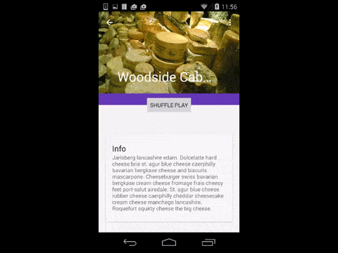
This is a sticky header put in the middle between Toolbar and RecyclerView:
<Button
    android:layout_width="wrap_content"
    android:layout_height="wrap_content"
    app:layout_anchor="@+id/app_bar_layout"
    app:layout_anchorGravity="center|bottom"
    android:text="Shuffle Play"/>
To avoid overlaping with the Toolbar you can set different heights to AppBarLayout and CollapsingToolbarLayout:
<android.support.design.widget.CoordinatorLayout
xmlns:android="http://schemas.android.com/apk/res/android"
xmlns:app="http://schemas.android.com/apk/res-auto"
android:id="@+id/main_content"
android:layout_width="match_parent"
android:layout_height="match_parent"
android:fitsSystemWindows="true">

<android.support.design.widget.AppBarLayout
    android:id="@+id/appbar"
    android:layout_width="match_parent"
    android:layout_height="240dp"
    android:theme="@style/ThemeOverlay.AppCompat.Dark.ActionBar"
    android:fitsSystemWindows="true">

    <android.support.design.widget.CollapsingToolbarLayout
        android:id="@+id/collapsing_toolbar"
        android:layout_width="match_parent"
        android:layout_height="210dip"
        android:background="?attr/colorPrimary"
        app:layout_scrollFlags="scroll|exitUntilCollapsed"
        android:fitsSystemWindows="true"
        app:contentScrim="?attr/colorPrimary"
        app:expandedTitleMarginStart="48dp"
        app:expandedTitleMarginBottom="30dp"
        app:expandedTitleMarginEnd="64dp">

        <ImageView
            android:id="@+id/backdrop"
            android:layout_width="match_parent"
            android:layout_height="match_parent"
            android:scaleType="centerCrop"
            android:fitsSystemWindows="true"
            app:layout_collapseMode="parallax" />

        <android.support.v7.widget.Toolbar
            android:id="@+id/toolbar"
            android:layout_width="match_parent"
            android:layout_height="?attr/actionBarSize"
            app:popupTheme="@style/ThemeOverlay.AppCompat.Light"
            app:layout_collapseMode="pin" />
    </android.support.design.widget.CollapsingToolbarLayout>

</android.support.design.widget.AppBarLayout>


<android.support.v7.widget.RecyclerView
    android:id="@+id/recycler_view"
    android:layout_width="match_parent"
    android:layout_height="match_parent"
    android:layout_marginTop="@dimen/slide_handle_height"
    android:scrollbars="vertical"
    app:layout_behavior="@string/appbar_scrolling_view_behavior"/>

<Button
    android:layout_width="wrap_content"
    android:layout_height="wrap_content"
    app:layout_anchor="@id/appbar"
    app:layout_anchorGravity="center|bottom"
    android:text="Shuffle Play"/>
</android.support.design.widget.CoordinatorLayout>
Video demo:
Also, you can set a height to the Toolbarbut will need to make a custom title with a custom behaviour like this proyect CoordinatorLayoutExample. I made it with a custom title without behavior:
<android.support.design.widget.CoordinatorLayout
xmlns:android="http://schemas.android.com/apk/res/android"
xmlns:app="http://schemas.android.com/apk/res-auto"
android:id="@+id/main_content"
android:layout_width="match_parent"
android:layout_height="match_parent"
android:fitsSystemWindows="true">

<android.support.design.widget.AppBarLayout
    android:id="@+id/appbar"
    android:layout_width="match_parent"
    android:layout_height="240dp"
    android:theme="@style/ThemeOverlay.AppCompat.Dark.ActionBar"
    android:fitsSystemWindows="true">

    <android.support.design.widget.CollapsingToolbarLayout
        android:id="@+id/collapsing_toolbar"
        android:layout_width="match_parent"
        android:layout_height="match_parent"
        android:background="?attr/colorPrimary"
        app:layout_scrollFlags="scroll|exitUntilCollapsed"
        android:fitsSystemWindows="true"
        app:collapsedTitleTextAppearance="@style/TransparentText"
        app:expandedTitleTextAppearance="@style/TransparentText"
        app:contentScrim="?attr/colorPrimary">

        <ImageView
            android:id="@+id/backdrop"
            android:layout_width="match_parent"
            android:layout_height="match_parent"
            android:scaleType="centerCrop"
            android:fitsSystemWindows="true"
            app:layout_collapseMode="parallax" />

        <android.support.v7.widget.Toolbar
            android:id="@+id/toolbar"
            android:layout_height="80dp"
            android:layout_width="match_parent"
            android:minHeight="?attr/actionBarSize"
            android:gravity="top"
            app:popupTheme="@style/ThemeOverlay.AppCompat.Light"
            app:layout_collapseMode="pin" >
            <TextView
                android:layout_width="wrap_content"
                android:layout_height="wrap_content"
                android:text="Title"
                android:textSize="20sp"
                android:textColor="@android:color/white"/>
        </android.support.v7.widget.Toolbar>
    </android.support.design.widget.CollapsingToolbarLayout>

</android.support.design.widget.AppBarLayout>


<android.support.v7.widget.RecyclerView
    android:id="@+id/recycler_view"
    android:layout_width="match_parent"
    android:layout_height="match_parent"
    android:layout_marginTop="@dimen/slide_handle_height"
    android:scrollbars="vertical"
    app:layout_behavior="@string/appbar_scrolling_view_behavior"/>

<Button
    android:layout_width="wrap_content"
    android:layout_height="wrap_content"
    app:layout_anchor="@id/appbar"
    app:layout_anchorGravity="center|bottom"
    android:text="Shuffle Play"/>
</android.support.design.widget.CoordinatorLayout>
Styles:
<style name="TransparentText" parent="@android:style/TextAppearance">
    <item name="android:textColor">#00000000</item>
</style>
Video demo:

After some trial and error, this is the condensed version of the layout that ended up working for me:
<android.support.design.widget.CoordinatorLayout
    xmlns:android="http://schemas.android.com/apk/res/android"
    xmlns:app="http://schemas.android.com/apk/res-auto"
    xmlns:tools="http://schemas.android.com/tools"
    android:id="@+id/coordinator_layout"
    android:layout_width="match_parent"
    android:layout_height="match_parent">

<android.support.design.widget.AppBarLayout
    android:id="@+id/app_bar_layout"
    android:layout_width="match_parent"
    android:layout_height="@dimen/collapsible_app_bar_height"
    android:theme="@style/ThemeOverlay.AppCompat.Dark.ActionBar">

    <android.support.design.widget.CollapsingToolbarLayout
        android:id="@+id/collapsing_toolbar_layout"
        android:layout_width="match_parent"
        android:layout_height="match_parent"
        app:contentScrim="@color/background_content_frame"
        app:layout_scrollFlags="scroll|exitUntilCollapsed">

        <ImageView
            android:id="@+id/image_header"
            android:layout_width="match_parent"
            android:layout_height="match_parent"
            android:layout_gravity="center_horizontal"
            android:layout_marginBottom="@dimen/button_bar_height"
            android:scaleType="centerCrop"
            android:background="@android:color/transparent"
            android:src="@drawable/default_header"
            android:contentDescription="@string/description_content_image"
            app:layout_collapseMode="parallax"/>

        <ImageView
            android:id="@+id/image_header_gradient"
            android:layout_width="match_parent"
            android:layout_height="match_parent"
            android:layout_marginBottom="@dimen/button_bar_height"
            android:src="@drawable/scrim_top_bottom_banner"
            app:layout_collapseMode="parallax"
            tools:ignore="ContentDescription"/>

        <android.support.v7.widget.Toolbar
            android:id="@+id/collapsible_toolbar"
            android:layout_width="match_parent"
            android:layout_height="104dp"
            android:minHeight="?attr/actionBarSize"
            android:gravity="top"
            android:theme="@style/ThemeOverlay.AppCompat.Dark.ActionBar"
            app:contentInsetStart="0dp"
            app:titleMargins="0dp"
            app:layout_collapseMode="pin"/>

        <RelativeLayout
            android:layout_width="match_parent"
            android:layout_height="wrap_content"
            android:layout_marginStart="@dimen/landing_header_button_margin_horizontal"
            android:layout_marginEnd="@dimen/landing_header_button_margin_horizontal"
            android:layout_marginBottom="@dimen/button_bar_height"
            android:layout_gravity="bottom"
            android:gravity="center_vertical"
            app:layout_collapseMode="parallax">

            <Button
                android:id="@+id/button_one"
                android:layout_alignParentStart="true"
                android:drawableStart="@drawable/selector_one"
                android:textColor="@color/alabaster_white"
                android:visibility="gone"
                style="@style/Button.TextCount"/>

            <Button
                android:id="@+id/button_two"
                android:layout_alignParentEnd="true"
                android:layout_gravity="end"
                android:drawableStart="@drawable/selector_two"
                android:textColor="@color/alabaster_white"
                android:visibility="gone"
                style="@style/Button.TextCount"/>

        </RelativeLayout>

        <LinearLayout
            android:layout_width="match_parent"
            android:layout_height="@dimen/button_bar_height"
            android:layout_gravity="bottom"
            android:gravity="center_vertical"
            android:orientation="horizontal"
            android:background="@color/slide_handle">

            <!-- three buttons -->

        </LinearLayout>

    </android.support.design.widget.CollapsingToolbarLayout>

</android.support.design.widget.AppBarLayout>

<android.support.v7.widget.RecyclerView
    android:id="@+id/recycler_view"
    android:layout_width="match_parent"
    android:layout_height="match_parent"
    android:scrollbars="vertical"
    app:layout_behavior="@string/appbar_scrolling_view_behavior"/>
Ryan's approach is good but might be a little complicated. You can achieve the same effect easier by using CoordinatorLayout's attributes to its children. Use
layout_anchor="@id/app_bar_layout"
and
layout_anchorGravity="bottom|right|end"
in a view(containing your buttons) and place it under the Toolbar. Also increase elevation on this view because when you scroll down the Toolbar will overlap your view.
You can try this
    <android.support.design.widget.CoordinatorLayout>
         <android.support.design.widget.AppBarLayout>
             <!-- another xml code -->
         </<android.support.design.widget.AppBarLayout>

         <android.support.v4.widget.NestedScrollView
              android:layout_width="match_parent"
              android:layout_height="match_parent"
              app:layout_behavior="android.support.design.widget.AppBarLayout$ScrollingViewBehavior">

<!-- your recyler view or button or textview xml code -->
   </android.support.v4.widget.NestedScrollView>

</android.support.design.widget.CoordinatorLayout>
or
you can write this code in strings.xml
<string name="appbar_scrolling_view_behavior" translatable="false">android.support.design.widget.AppBarLayout$ScrollingViewBehavior</string>
and you can use:
app:layout_behavior="@strings/appbar_scrolling_view_behavior">
来源:https://stackoverflow.com/questions/32465548/add-app-bar-scrolling-view-behavior-to-multiple-views-in-coordinatorlayout