
欢迎大家收看react-native-android系列教程,跟着本系列教程学习,可以熟练掌握react-native-android的开发,你值得拥有:
http://my.oschina.net/MrHou/blog?catalog=3590216&temp=1466310573630
本章,咱们一起动个手,来模仿一下手机百度的新闻流。学习一样东西,最好在有了一定基础之后,最好照着已有的一些产品,简单的实现一下。
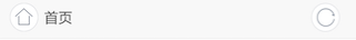
1. 手机百度的feed流样式观察
动手之前,我们先来看看手机百度新闻feed流,都由那些元素组成吧,如图1.1:
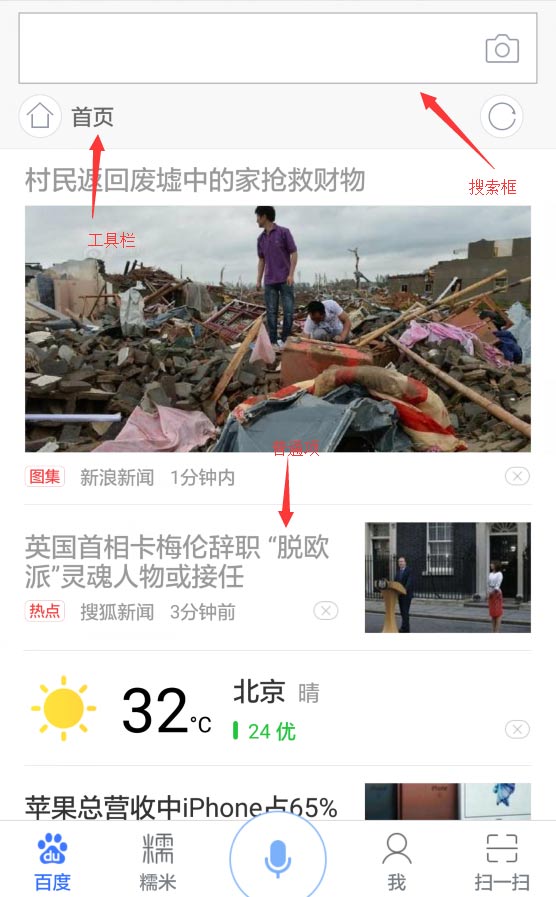
图1.1
我们看到,整体由上方的搜索框+工具条组成,我们暂且叫上方部分为搜索区吧,下方则是由新闻内容区组合而成。下方是由几个工具组成的底部工具栏。在滑动下方新闻feed流过程中,上方的搜索区位置不变。下方的工具栏位置也不变。
2. 设计目录结构及代码书写
好了,我们大致的结构分析完了。要coding?别捉急,我们在coding之前还是要好好设计目录结构的。根据上面分析的信息,我们决定先将整个activity拆分为三大块。
1. 搜索区
2. 中间内容区
3. 底部工具栏区
2.1 拆分模块
所以,我认为,首先要将三个区块拆为三个模块。我们需要一个static文件夹,然后我们在static文件夹下,为每个区域生成一个模块(如图2.1.0):
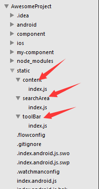
图2.1.0
接下来的样式文件,也是各自放于自己的模块中去维护,包括图片,通过这种方式,组件可以很好的成为一个整体。
比如,我们的searchArea组件,我们在searchArea中创建一个index.js存放searchArea组件的类与jsx元素。而我们将它的样式放在同目录下的style.js里面,如图2.1.1所示:
图2.1.1
好了,组件都建立好了。我们开始书写主入口代码吧。
2.2 reactjs基础粗讲(学过react-web的同学,可跳过)
初学react的同学可能会迷惑,之前不都是写在一个文件里吗,为什么可以拆分成好几个文件,我们在这里简单的先讲解一下react的基础,之后我会在我的reac-native-android系列教学中,详细讲解这一基础知识。
reactjs中,组件概念是比较强的,举一个简单的例子,我们写一个简单的、分多个快组成的应用的时候,可能会这样写:
class App extends Component {
    constructor(props) {
        super(props);
    }

    render() {
        return <View>
            <View><Text>这是这个应用的第一块</Text></View>
            <View><Text>这是这个应用的第二块</Text></View>
        </View>
    }
}

AppRegistry.registerComponent('hellowReact', () => hellowReact);
我们看到,这个应用由两个快组成。两个块儿的逻辑如果非常复杂的话,放在一个类里面维护,是个非常痛苦的事情。
所以react主张,将自己的应用化为多个组建。这样,复用行得到了提高,维护成本也大大降低了。所以,按照标准做法,我们可以将上述两个块儿,拆解成两个组件:
class App extends Component {
    constructor(props) {
        super(props);
    }

    render() {
        return <View>
            <BlockOne />
            <BlockTwo />
            <View><Text>这是这个应用的第二块</Text></View>
        </View>
    }
}

class BlockOne extends Component {
    constructor(props) {
        super(props);
    }

    render() {
        return <View><Text>这是这个应用的第一块</Text></View>;
    }
}

class BlockTwo extends Component {
    constructor(props) {
        super(props);
    }

    render() {
        return <View><Text>这是这个应用的第二块</Text></View>;
    }
}

AppRegistry.registerComponent('hellowReact', () => hellowReact);
这样达到了代码封装的效果,react支持将两个组建作为基础组建使用,就像上面代码中的BlockOne与BlockTwo,都是可以当做普通组建被插入到组建中去的。
接下来,我们将BlockOne与BlockTwo拆出去,变成两个文件。这样,代码之间就互相隔离了,代码如下:
/**
 * @file index.android.js
 * @author 侯禹
 * @desc 应用的主入口
 */

// 将两个组件以模块的形式导入
let BlockOne = require('blockOne.js');
let BlockTwo = require('blockTwo.js');

class App extends Component {
    constructor(props) {
        super(props);
    }

    render() {
        // 直接使用写好的两个组件,以标签的形式使用即可
        return <View>
            <BlockOne />
            <BlockTwo />
            <View><Text>这是这个应用的第二块</Text></View>
        </View>
    }
}

AppRegistry.registerComponent('hellowReact', () => hellowReact);
/**
* @file blockOne.js
* @author 侯禹
* @desc 第一块儿的组件
*/
class BlockOne extends Component {
constructor(props) {
super(props);
}
render() {
return <View><Text>这是这个应用的第一块</Text></View>;
}
}
// 将组件导出
module.exports = BlockOne;/**
* @file blockTwo.js
* @author 侯禹
* @desc 第二块儿的组件
*/
class BlockTwo extends Component {
constructor(props) {
super(props);
}
render() {
return <View><Text>这是这个应用的第二块</Text></View>;
}
}
// 将组件导出
module.exports = BlockTwo;上面这种形式的代码,在reactjs中是非常常见的。所以各位看官,也尽量要使用这种组件化的方法去写react。接下来,我们的样例代码,也会使用这种组件化的方法去写。
2.3 入口代码
看过我之前教程的同学们可能还记得,react-native工程的入口js文件,安卓版本的是:'index.android.js'。
我们就先将主入口文件搭建成一个空的架子。
import React, { Component } from 'react';
import {
    AppRegistry,
    StyleSheet,
    Text,
    View,
    ListView,
    Image,
    NativeModules
} from 'react-native';

class hellowReact extends Component {
    constructor(props) {
        super(props);
        this.state = {};
    }
    render() {
        return (
            <View style={styles.container}>
            </View>
        );
    }
}

const styles = StyleSheet.create({
    container: {
        flex: 1,
        flexDirection: 'column',
        backgroundColor: '#fff',
    },
});

AppRegistry.registerComponent('hellowReact', () => hellowReact);
运行上述代码,我们会看到一片空白,这是因为我们只写了一个view,其他的什么都没有写(如图2.3.1):
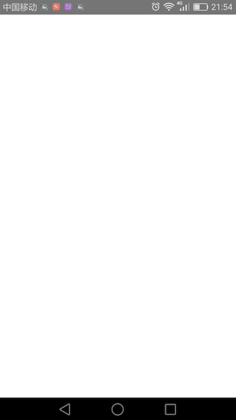
图2.1.1
2.4 搜索框部分组件(searchArea)
我们先写搜索框部分的jsx和样式,如图2.4.1。
图2.4.1
我们将两个素材从手机百度的包中拽出来(将手机百度apk的后缀名从.apk改成.zip,然后解压,在其中找找就能找到,或者在本文后面的示例代码中也能找到)。
然后开始书写index.js
我们首先要将必要的基础模块和两个图片引入:
'use strict'
// 必要的基础模块
import React, {Component} from 'react';
import {
    View,
    Text,
    Image
} from 'react-native';

// 所需要的两张资源图片(均从百度的apk中获取)
let homeIcon = require('./icn_feed_go_home.png');
let refreshIcon = require('./icn_feed_refresh.png');
然后我们开始书写自己的react组件,SearchArea,我们先把组件的结果大致写出来,我们会有一个外围包裹的View,然后上面会有一个搜索框,下面有一个工具栏的包裹用的view:
class SearchArea extends Component {

    constructor(props) {
        super(props);
        this.state = {
        };
    }

    render() {
        return (
            <View>
                <View></View>
                <View></View>
            </View>
        );
    }
}

module.exports = SearchArea;
接下来,我们为其添加样式,还是老办法,我们将以前与组建写在一起的style,放在style.js中,再将其导出,并在index.js中,将其引入:
/*
 * @file searchArea/style.js
 * @author houyu
 * @desc 模拟手百的搜索框区域
 */
'use strict'
import React, {Component} from 'react';
import {
    StyleSheet,
    Image
} from 'react-native';

// 创建样式
const headminiStyle = StyleSheet.create({
    topBar: {
        height: 90,
        backgroundColor: '#f8f8f8',
        borderBottomWidth: 1,
        borderColor: '#f2f2f2',
    },
});

// 将样式导出
module.exports.headminiStyle = headminiStyle;
我们在样式中增加一个搜索区域的大致样式,方便我们自己先查看一下(效果如图2.4.2):
// 引入自己模块的样式
import headStyle from './style.js';

class SearchArea extends Component {

    constructor(props) {
        super(props);
        // 将样式放在state中
        this.state = {
            headStyle: headStyle.headminiStyle
        };
    }

    render() {
        //  用state中存下的样式去渲染
        return (
            <View style={this.state.headStyle.topBar}>
                <View></View>
                <View></View>
            </View>
        );
    }
}

module.exports = SearchArea;
图2.4.2
接着我们细化一下,将搜索框部分。写出点样式来:
const headminiStyle = StyleSheet.create({
    topBar: {
        height: 90,
        backgroundColor: '#f8f8f8',
        borderBottomWidth: 1,
        borderColor: '#f2f2f2',
    },
    searchbox: {
        flex: 5,
        marginTop: 7,
        marginLeft: 9,
        marginRight: 9,
        borderColor: '#d0d2d5',
        borderWidth: 1,
    },
    toolBar: {
        flex: 4,
        marginLeft: 9,
        marginRight: 9,
    },
});
这里,我们就用到了上节课说到的flex,搜索框与工具栏的高度比例大概是5:4,于是我们写了两个样式的flex为5与4,再将搜索框的边框与背景勾勒出来,就得到了一个大概的搜索框部分(如图2.4.3):

图2.4.3
紧接着,我们需要在下面的工具栏里面加上左边的首页按钮(如图2.4.1),和右边的刷新按钮(如图2.4.2),左边是一个图片+一个文字块(首页),右边是一个刷新图片
图2.4.1
图2.4.2
class SearchArea extends Component {

    constructor(props) {
        super(props);
        this.state = {
            headStyle: headStyle.headminiStyle
        };
    }

    render() {
        return (
            <View style={this.state.headStyle.topBar}>
                <View style={this.state.headStyle.searchbox}></View>
                <View style={this.state.headStyle.toolBar}>
                    <View style={this.state.headStyle.toIndex}>
                        <Image
                            source={homeIcon}
                            style={this.state.headStyle.topBarHomeIcon}
                        />
                        <Text>首页</Text>
                    </View>
                    <View style={this.state.headStyle.refresh}>
                        <Image
                            source={refreshIcon}
                            style={this.state.headStyle.topBarRefreshIcon}
                        />
                    </View>
                </View>
            </View>
        );
    }
}
我们将元素都写好,加上样式:
const headminiStyle = StyleSheet.create({
    topBar: {
        height: 90,
        backgroundColor: '#f8f8f8',
        borderBottomWidth: 1,
        borderColor: '#f2f2f2',
    },
    searchbox: {
        // flex的高度占比为搜索框5,工具栏4--5:4
        flex: 5,
        marginTop: 7,
        marginLeft: 9,
        marginRight: 9,
        borderColor: '#d0d2d5',
        borderWidth: 1,
    },
    toolBar: {
        flex: 4,
        // 让首页按钮与刷新按钮,横向并排
        flexDirection: 'row',
        // 让首页按钮与刷新按钮,上下处于居中对其
        alignItems: 'center',
        // 让首页按钮与刷新按钮左右
        justifyContent: 'space-between',
        marginLeft: 9,
        marginRight: 9,
    },
    toIndex: {
        // 让首页图片与首页文字并排成一行
        flexDirection: 'row',
        // 让首页图标,与首页文字上下居中
        alignItems: 'center',
    },
    topBarHomeIcon: {
        // 背景图片拉伸
        resizeMode: Image.resizeMode.contain,
        height: 27,
        width: 27,
        marginRight: 5,
    },
    topBarRefreshIcon: {
        // 背景图片拉伸
        resizeMode: Image.resizeMode.contain,
        height: 45,
        width: 45,
    },
});
通过上面的带啊,我们又重温了一些上节的知识点,元素默认是垂直排列的,可是我们需要元素横向排列的话,就得用到flexDirection,设置为row。并且我们需要,"首页按钮"与"刷新按钮",并排显示,且左右分开(如图2.4.3):
图2.4.3
于是我们用到了 flexDirection: 'row', alignItems: 'center', justifyContent: 'space-between',这三个属性。于是,左边的首页按钮和右边的刷新按钮横排显示,且左右靠边了,垂直方向上,两侧的按钮也居中对其了。
接下来,我们看一下上部分的整体(如图2.4.4):

图2.4.4
接下来,我们先把内容区与底部的工具栏的大致形状给做出来。
2.5 内容区组建与底部栏组建(content与toolBar)
我们首先将三个组建块儿都引入进来:
// 三个组件块儿一一引入
const SearchArea = require('./static/searchArea');
const Content = require('./static/content');
const ToolBar = require('./static/toolBar');

class hellowReact extends Component {
    constructor(props) {
        super(props);
        this.state = {};
    }
    render() {
        // 三个组建块儿均渲染到主要容器上
        return (
            <View style={styles.container}>
                <SearchArea />
                <Content />
                <ToolBar />
            </View>
        );
    }
}

const styles = StyleSheet.create({
    container: {
        flex: 1,
        flexDirection: 'column',
        backgroundColor: '#fff',
    },
});

AppRegistry.registerComponent('hellowReact', () => hellowReact);
我们先把中间内容区与底部工具栏的比例按照设计图算出,得到大概这样的比例:
顶部搜索区高度 : 中间内容区高度 : 底部工具栏高度 = 9 : 41 : 5
于是我们将三块儿区域的fex分别写为:9/41/5。
我们把底部工具栏简写一下,目前用图片代替。
'use strict'
import React, {Component} from 'react';
import {
    View,
    Text,
    Image
} from 'react-native';
// 引入底部工具栏的样式
import {ToolBarStyle} from './style.js';
// 底部工具栏暂时不做,使用一张大的图片代替
let bottomBanner = require('./bottom_banner.png');

class ToolBar extends Component {

    constructor(props) {
        super(props);
    }

    render() {
        return (
            <View style={ToolBarStyle.bottomBar}>
                <Image
                    source={bottomBanner}
                    style={ToolBarStyle.bottomBanner}
                />
            </View>
        );
    }
}
// 导出组件
module.exports = ToolBar;
然后我们写一下没有内容的中间区域,样式也很简单,就是一个白色的块儿:
'use strict'
import React, {Component} from 'react';
import {
    View,
    Text,
    Image,
    ListView
} from 'react-native';
import {contentStyle} from './style.js';

class Content extends Component {

    constructor(props) {
        super(props);
        this.state = {};
    }

    render() {
        return (
            <View style={contentStyle.content}>
            </View>
        );
    }
}

module.exports = Content;
'use strict'
import React, {Component} from 'react';
import {
StyleSheet,
Image,
} from 'react-native';
const contentStyle = StyleSheet.create({
content: {
flex: 41,
backgroundColor: '#fff',
},
});
module.exports.contentStyle = contentStyle;效果如图2.5.1:

图2.5.1
请注意下面的工具栏用的是图片哦。
2.6 新闻列表
紧接着,因为我们的内容区是新闻列表,所以我们需要一个列表组件。我们还需要去写每一个item的样式。
react-native中有一个原生组建,叫做listView,顾名思义,这就是个列表组件,下面我们就将会用这个列表组建完成我们的新闻列表。
2.6.1 listView的使用方法
listView需要两个基本的属性一个是dataSoutce,接受列表的数据,另一个是renderRow,指定对于列表中的每一项的渲染方法。
    render() {
        return (
            <View style={contentStyle.content}>
                <ListView
                    dataSource={this.state.dataSource}
                    renderRow={this.renderOneRow}
                />
            </View>
        );
    }
datasource中传入的数据,需要是DataSource型。所以,我们先建立一个假数据(数据的话,看一下手白大致一个条目上都有哪些信息,抄一下即可):
    constructor(props) {
        super(props);
        var list = [
            {
                title: '英国首相卡梅伦辞职"脱欧派"灵魂人物或接任',
                from: '搜狐新闻',
                time: '3分钟前',
                tag: '视频',
                images: ['http://static.oschina.net/uploads/user/588/1177792_100.jpg?t=1465096324000']
            },
            {
                title: '2.英国首相卡梅伦辞职"脱欧派"灵魂人物或接任',
                from: '搜狐新闻',
                time: '3分钟前',
                tag: '视频',
                images: ['http://static.oschina.net/uploads/user/588/1177792_100.jpg?t=1465096324000']
            },
        ];
        var ds = new ListView.DataSource({rowHasChanged: (r1, r2) => r1 !== r2});
        this.state = {
            dataSource: ds.cloneWithRows(list)
        };
    }
我们还需要建造一个简单的、渲染每一个item的渲染方法--renderOneRow:
renderOneRow(rowData) {
    return <View><Text>一筒最可爱</Text></View>;
}
请注意,这里的rowData就是listView在遍历我们传入的dataSource的时候,给我们的渲染函数传入遍历的当前项数据。
我们可以看到粗略的展示了一个list如图2.6.1
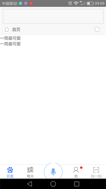
图2.6.1
因为我们的假数据写死了两个,所以list中出现了两项。
我们将这两项再变换一下,写成手机百度的样式,我们先来看看手机百度中,每一项大概的层级,应该是左右结构,右边是图片区域,左侧是文字区域。所以,话不多说,先来两个区域再说(如图2.6.2):

图2.6.2
renderOneRow(rowData) {
    return <View style={contentStyle.itemContainer}>
        <View style={contentStyle.itemContent}>
            <View style={contentStyle.textArea}>
            </View>
            <View style={contentStyle.imgArea}>
                <Image
                    source={{uri: rowData.images[0]}}
                    style={contentStyle.rightImg}
                />
            </View>
        </View>
    </View>;
}
代码如上,右侧使用一个view包裹的图片,左侧使用一个包裹的view(如图2.6.3所示):
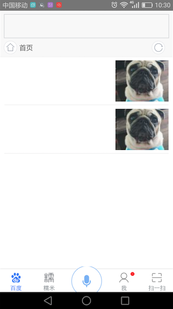
图2.6.3
const contentStyle = StyleSheet.create({
    content: {
        flex: 41,
        backgroundColor: '#fff',
    },
    // 每一项的容器的样式,左右留白10dp,高度为100dp
    itemContainer: {
        height: 100,
        paddingHorizontal: 10,
    },
    // 每一项的内部包裹
    itemContent: {
        height: 99,
        // 指定横向排列
        flexDirection: 'row',
        // 内部元素上线居中
        alignItems: 'center',
        // 底部一个灰边
        borderBottomWidth: 1,
        borderBottomColor: '#eee',
    },
    textArea: {
        // 因为不选用成比例,使用flex:1,左侧的文字区域填充满除了图片剩下的那部分区域
        flex: 1,
        height: 70,
        paddingRight: 12,
    },
    imgArea: {
        height: 85,
        width: 110,
    },
    rightImg: {
        height: 85,
        width: 110,
        backgroundColor: '#000',
        // 指定内容图片填充方式
        resizeMode: Image.resizeMode.cover,
    },
});
这样我们就完成了一个基本的item,这个item是左右结构的,左侧的文字区域我们再进一步细化:
左侧文字区域,可以看出是上下结构的(如图2.6.4),高度比例大概是4:1

图2.6.4
于是,我们填充了两个块儿,并且左侧内容区域的flexDirection就默认为column就好了。
    renderOneRow(rowData) {
        return <View style={contentStyle.itemContainer}>
            <View style={contentStyle.itemContent}>
                <View style={contentStyle.textArea}>
                    <Text style={contentStyle.textContent}>
                    </Text>
                    <View style={contentStyle.tagArea}>
                    </View>
                </View>
                <View style={contentStyle.imgArea}>
                    <Image
                        source={{uri: rowData.images[0]}}
                        style={contentStyle.rightImg}
                    />
                </View>
            </View>
        </View>;
    }
tagArea: {
flex: 1,
backgroundColor: '#f00',
flexDirection: 'row',
alignItems: 'center',
justifyContent: 'space-between',
},
textContent: {
flex: 4,
backgroundColor: '#0f0',
fontSize: 16,
fontWeight: 'bold',
color: '#000',
},效果如图2.6.5所示:

图2.6.5
good!我们完成了一个上线结构,接着,我们将新闻每一条的标题,填充到上面的绿色框中去(如图2.6.6所示),获取数据,直接从rowData中拿就行,rowData指代的就是上面咱们写的假数据中的每一条:
    renderOneRow(rowData) {
        return <View style={contentStyle.itemContainer}>
            <View style={contentStyle.itemContent}>
                <View style={contentStyle.textArea}>
                    <Text style={contentStyle.textContent}>
                        {rowData.title}
                    </Text>
                    <View style={contentStyle.tagArea}>
                    </View>
                </View>
                <View style={contentStyle.imgArea}>
                    <Image
                        source={{uri: rowData.images[0]}}
                        style={contentStyle.rightImg}
                    />
                </View>
            </View>
        </View>;
    }
图2.6.6
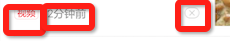
接下来的下方tag要注意,是由三个元素组成的左左右,怎么办(如图2.6.7),flex布局中,并没有讲到,如何左左右,只知道如何居中,如何将元素打散到两侧............等等,其实左左右这种结构,不正是左右结构吗?左边是一个由两个元素组成的view,右边是一个由一个元素组成的view,这样一想,我们的思路瞬间清晰了许多,如图2.6.8所示
图2.6.7

图2.6.8
左侧的红色区域可以放入两个tag"视频"和"2分钟前"。如法炮制,我们写两个小的text,即可完成,如图2.6.9所示:
    renderOneRow(rowData) {
        return <View style={contentStyle.itemContainer}>
            <View style={contentStyle.itemContent}>
                <View style={contentStyle.textArea}>
                    <Text style={contentStyle.textContent}>
                        {rowData.title}
                    </Text>
                    <View style={contentStyle.tagArea}>
                        <View style={contentStyle.tags}>
                            <View style={contentStyle.tagContainer}>
                                <Text style={contentStyle.tagEntity}>
                                    {rowData.tag}
                                </Text>
                            </View>
                            <Text style={contentStyle.srcNet}>
                                {rowData.from}
                            </Text>
                        </View>
                        <View style={contentStyle.closeTag}>
                            <Text style={contentStyle.closeTagText}>X</Text>
                        </View>
                    </View>
                </View>
                <View style={contentStyle.imgArea}>
                    <Image
                        source={{uri: rowData.images[0]}}
                        style={contentStyle.rightImg}
                    />
                </View>
            </View>
        </View>;
    }
图2.6.9
我们再把假数据多写点,于是一个list就完整的展现了出来:

图2.6.10
3 课后作业
又到了课后作业时间,今天的作业是,请完成如图3.1所示形状的item:
聪明的读着,知道该怎么做了吗?
本文中提到的例子与素材,均在下面的github上,需要的话请下载:
https://github.com/houyu01/react-native-android-tutorial/tree/master/baiduapp
接下来,我会详细的讲解一下reactjs的基础知识。包括本节中提到的创建组件等,不要走开,请关注我.....
http://my.oschina.net/MrHou/blog/702561
原创文章,版权所有,转载请注明出处
来源:oschina
链接:https://my.oschina.net/u/1177792/blog/701292