问题
I've noticed a slight issue using rems when it comes to comparing how they render in Chrome and Firefox.
Using the following CSS:
html {
  font-size: 62.5%;
}

.rem-test {
  width: 50%;
  height: 20rem;
  background: red;
}
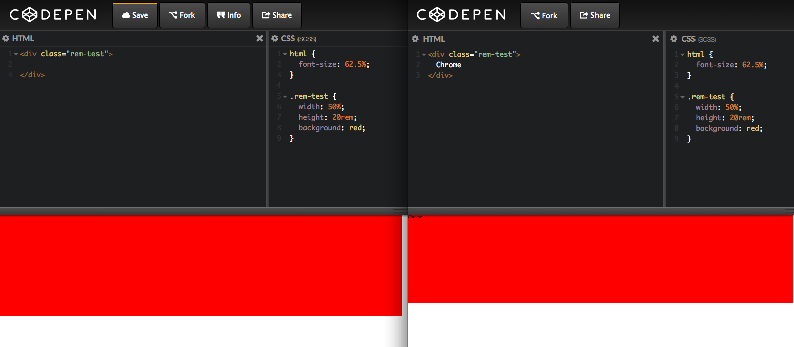
The results are slightly different when rendered, Firefox shows the box shorter than it looks in Chrome:
Is there something I can do to stop this happening?
Here's a pen: http://codepen.io/abbasinho/pen/WbJWNq
回答1:
That happens most certainly because your browsers have different font-size settings, you can easily check it with this fork of your codepen.
alert(document.querySelector('.rem-test').scrollHeight);
If the alerted values are different in chrome and firefox you should definitely check your font-size settings.
回答2:
In Chrome you can look at chrome://settings/appearance and verify the property "Font size", the recommended value is "Medium".
Personally, i had the value "Large" and css attributes like margin, padding, line-height, font-size looked quite different. All was solved setting "Font-Size" to "Medium"
回答3:
Had the exact same "issue". In my case it had to do with the Windows 10 enlarged font and item size.
Firefox takes this into account en shows everything 1.25 times enlarged when set to 125%. While chrome does not.
So 14px in Firefox becomes: 17.5px on the monitor and in chrome it stays at 14px.
回答4:
Since rem is computed using the font size of your html (that is the font size of body is 5px then 20rem will be 100px) you need to have uniform font sizes across browsers.
Try adding modifying the font size in code pen.
Add-
body, html {
    font-size:15px;
}
Everything should work similarly now.
来源:https://stackoverflow.com/questions/28718688/rems-rendering-differently-between-chrome-and-firefox