The iPhone 6 and iPhone 6 Plus were just announced. But as usual, phone specs never give the meta viewport device-width sizes in CSS Pixels or DPR at width=device-width,initial-scale=1.
Predictions have been made, speculating on 375/414px viewport width, but that still remains unclear...
NB: Please don't speculate or post answers with the known overall device resolution or specs, it's not what I am looking for. I want the default responsive portrait and landscape viewport-width in pixels.
(css) device-width of iPhone 6 is 375px, of iPhone 6 Plus is 414px. Note that iPhone 6 Plus report window.devicePixelRatio = 3 (while not truly at 3 DPR)
Update 1: just to clarify, I believe this is NOT a prediction, but actually tested. See more detailed and reputable reference. If in doubt, you can wait for device to be out.
Update 2: for users with Display Zoom enabled on iPhone 6, css viewport in Mobile Safari fallback to 320px (like iPhone 5); for iPhone 6 Plus, it fallback to 375px (like iPhone 6).

According to CSSpixels
iPhone 6: 1334x750, viewport 667x375
iPhone 6+: 2208x1242 *, viewport 736x414 *
Device-width is indeed 375x667, but that does not mean the viewport is that size. Here is an empirical sample. Note that the numbers are rounded to the 10s. 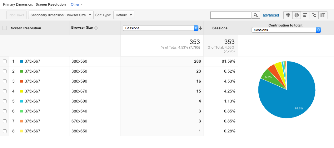
来源:https://stackoverflow.com/questions/25754848/what-are-the-device-width-css-viewport-sizes-of-the-iphone6-and-iphone-6-plus