4.弹性盒模型
4.1.什么是弹性盒模型
css3引入了一种新的布局模式,叫做Flexbox布局,即伸缩布局和(Flexible Box)模型,很多地方又称为弹性盒模型,我们下面都叫弹性盒模型,它可以用来提供一个更加有效的方式制定、调整和分布一个容器里的项目布局
css中的布局方式总结:
块布局
行内布局
表格布局
定位布局
FlexBox布局(css3新引入)
4.2.掌握Flexbox模型中的术语
1.主轴和侧轴
主轴和侧轴你可以简单的理解为水平和垂直方向上的两根轴,类似x轴和y轴,默认情况下主轴是水平方向的,但是可以设置,将主轴设置成垂直方向,主轴外的另一轴就是侧轴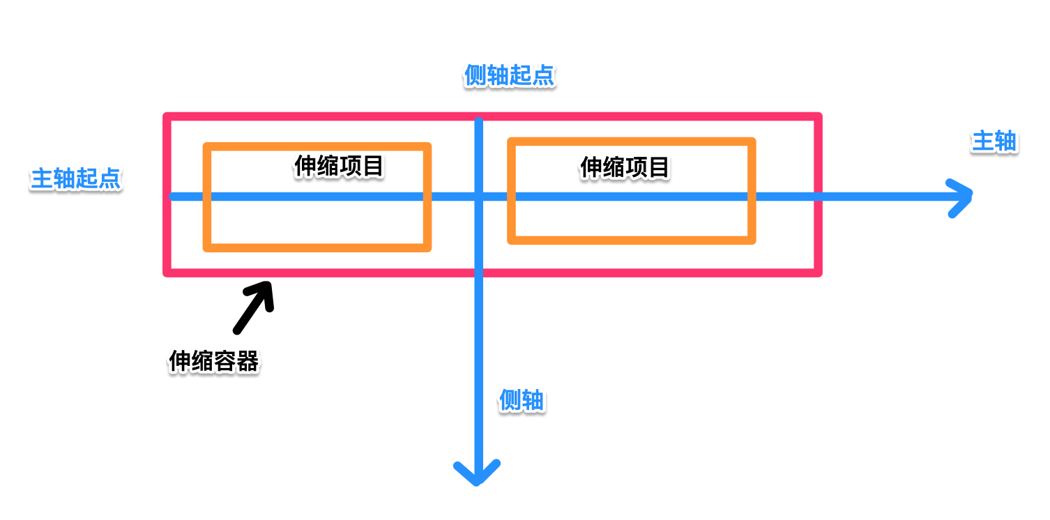
2.伸缩容器和伸缩项目
伸缩容器就是通过display属性设置为flex或者inline-flex的容器(盒子),伸缩项目就是这个伸缩容器下面的子元素
4.3.新版本和老版本
Flexbox布局语法规范主要分为三种:
旧版本:2009年版本,使用display:box或者display:inline-box

混合版本: 2011年版本,使用display:flexbox 或者display:inlne-flexbox

最新版本: 使用display:flex 或者 display:inlne-flex
查看Flexbox兼容性支持情况
https://caniuse.com/#search=flexbox
4.4.flex初体验
<!DOCTYPE html>
<html lang="en">
  <head>
    <meta charset="UTF-8" />
    <meta name="viewport" content="width=device-width, initial-scale=1.0" />
    <meta ="X-UA-Compatible" content="ie=edge" />
    <title>Document</title>
    <style>
      .box {
        height: 100px;
        background-color: green;
        display: flex;
      }
      .box div {
        height: 80px;
        width: 80px;
        margin: auto;
        background-color: orangered;
      }
    </style>
  </head>
  <body>
    <div class="box">
      <div class="box-item_1">1</div>
      <div class="box-item_2">2</div>
      <div class="box-item_3">3</div>
      <div class="box-item_4">4</div>
    </div>
  </body>
</html>
4.5.新版本弹性盒模型
容器上相关属性
1.设置主轴
display: flex;
/* 设置主轴为水平 */
/* flex-direction: row; */
/* 设置主轴方向为垂直 */
flex-direction: column;
2.设置项目排序方向
/*
使用flex-direction来设置主轴和项目的排序方向
flex-direction:有四个值,分别是row(水平正方向)、row-revers(水平反方向)、column(垂直正方向)、column-revers(垂直反方向)
*/
flex-direction: column-reverse;
总结:伸缩项目总是沿着主轴正方向排列
3.对齐方式
先说富裕空间概念,富裕空间字面上理解就是多余的空间,也就是子元素排列后剩下的空间,不管是主轴还是侧轴上都有富裕空间这个概念
新版本
/*
主轴 justify-content: 5个选项值
   flex-start: 项目位于容器的开头,富裕空间在后
   flex-end: 富项目位于容器的结尾, 富裕空间在前
   center: 项目位于容器的中心,富裕空间在两边
   space-between: 富裕空间在项目之间
   space-around: 项目位于各行之前、之间、之后都留有空白的容器内。富裕空间在项目前后都有
*/
display: flex;
justify-content: flex-end;
/*
侧轴  align-items: 5个选项值
flex-start: 元素位于容器的开头(起点对齐(
flex-end: 元素位于容器的结尾(终点对齐)
center:元素位于容器的中心。(居中对齐)
baseline: 元素位于容器的基线上(基线对齐)
stretch: 默认值。元素被拉伸以适应容器
*/
display: flex;
justify-content: flex-end;
align-items: baseline;
4.伸缩换行
/*
no-wrap: 单行显示
wrap: 多行显示
wrap-reverse:多行显示,排列顺序和wrap相反
*/
flex-wrap: wrap;
5.伸缩流方向与换行flex-flow
6.堆栈伸缩行
伸缩项目上的相关属性
1.伸缩性flex
2.显示顺序order
4.6.老版本弹性盒模型
容器上相关属性
1.设置主轴
display: -webkit-box;
/* 设置主轴为水平 */
/* -webkit-box-orient: horizontal; */
/* 设置主轴为垂直 */
-webkit-box-orient: vertical;
2.设置项目排序方向
/*默认正方向: normal, 反方向为reverse*/
-webkit-box-direction: reverse;
3.对齐方式
/*
主轴:
-webkit-box-pack
  start:起点对齐
  end: 终点对齐
  center:居中对齐
  justify: 两边对齐
*/
/*
侧轴:
-webkit-box-align
  start:起点对齐
  end: 终点对齐
  center:居中对齐
  justify: 两边对齐
*/
螺钉课堂视频课程地址:http://edu.nodeing.com
来源:https://www.cnblogs.com/dadifeihong/p/12028738.html