Constructing a responsive website

In today\'s web development community, It is almost \'standard practise\' to make a website \"fully responsive\" - meaning it would work on all screen sizes.
I curre
-
there are many ways in order to make a website responsive. It bottles down to so many factors.
You need to use RWD, which stands for Responsive Web Design. It means that you can deliver your webpage in a variable size of screen, without having to re-write your html over and over. This is very much a must-do if you had to work with mobile and/or tablet devices.
Use Dynamic Units
One of the most important features of making a webpage responsive is the units you use, so I'll mention that first of all. At the moment, you have 'hard coded' these values by using a (pixel) px unit, which would be seen as a 'static unit'.
Below is a couple of units you may want to consider in the generation of your markup:
The absolute length units are fixed in relation to each other and anchored to some physical measurement. They are mainly useful when the output environment is known. The absolute units consist of the physical units (in, cm, mm, pt, pc) and the px unit ~ w3.org
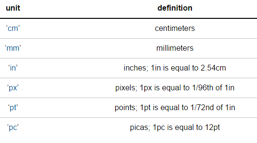
The above table displays what is known as 'absolute' units, and this is because they do not 'technically' change when you resize your browser or view on a mobile device.
Instead of using such units, you should consider using one of the 'dynamic' units. For example:
- percentage (%)
- viewport-width or viewport-height (vw and vh respectively)
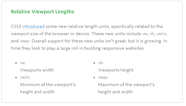 ~Image from this article note this is an old article, and support for these has improved a lot since
Using the likes of percentage, for example, means you can set the width and/or height of a div depending on your containing block's size.
For example, resize your screen here:
div {
  width: 50%;
  background: tomato;
  height: 50px;
}
You should notice how that div will always be '50% of its container'.
This would become very handy if you were building your website from scratch, but would also be useful if you were adapting one as well.
Use Media Queries
Media queries are great when used properly.
A media query is a logical expression that is either true or false. A media query is true if the media type of the media query matches the media type of the device where the user agent is running (as defined in the "Applies to" line), and all expressions in the media query are true.
A shorthand syntax is offered for media queries that apply to all media types; the keyword ‘all’ can be left out (along with the trailing ‘and’). I.e. if the media type is not explicitly given it is ‘all’.
For example, you could test something like "if my screen is smaller than 500px, use this css instead".
This would use a definition of something like:
@media (max-width:500px) {
//my css for when screen is lass than 500px wide
}
Several media queries can be combined in a media query list. A comma-separated list of media queries. If one or more of the media queries in the comma-separated list are true, the whole list is true, and otherwise false. In the media queries syntax, the comma expresses a logical OR, while the ‘and’ keyword expresses a logical AND
A simple demo of this would be:
div{
  width:500px;
  height:200px;
  background:gray;
  }

@media screen and (max-width:500px){
  div{
    width:100px;
    background:tomato;
    }

  }
Use a Responsive Plugin
(Personally not advised, but still valid)
Bootstrap is the most popular HTML, CSS, and JS framework for developing responsive webs.
Although I would advise not to using this, as it has a lot of 'unnecessary' css rules and hence I think it should only be used for 'concept code', and not production code.
Other Frameworks include:
- foundation 3
- skeleton
- Bootstrap
Use a combination of these
In reality, most developers would use a whole range of combinations of these. There isn't really a 'definitive' way of making a website responsive. However, hopefully you will be able to use some of this in future.

 加载中...
- 热议问题